The emergence of a worthwhile opposition in person of former military leader General Muhamadu Buhari a Muslim in the 2015 presidential election in Nigeria, the fifth election since 1999 when the military handed power to elected civilians coincided with a period of great tension between the north and south region. This tension resulted from the decision of the incumbent President Goodluck Jonathan a Christian to re-contest after earlier promises that he wouldn’t, thus causing many regions to feel cheated of their turn in producing the next president.
Nigerians at the time more than ever were divided along not just ethnic but religious lines. Worldwide, policy experts and media reports forecast showed that the 2015 elections could precipitate violence that would destabilize Africa’s biggest economy and most populous country, looking back at the historic election-related and communal violence in northern Nigeria following the April 2011 presidential voting that left more than 800 people dead.
While the survival of the country’s democracy was threatened amidst pervasive fear of uncertainty, I and my team at Orodata Nigeria, a civic technology startup understood that ‘a well informed electorate was a per-requisite for democracy’ and a peaceful electoral process, thus we thought it possible to alienate this fear and tension using innovative means to reveal and drive conversations around Open Data related to the elections as a key measure to building public confidence and civic inclusion.
Citizens in Nigeria after many elections in past held the results in contempt and distrust owning to unpleasant challenges they encounter during the processes; challenges ranging from electoral violence, insufficient voting materials, confusing ballots, failure of equipment and voter disenfranchisement, thus creating a lacuna for problem solving innovations and design. To effect change in the complex electoral process, in December 2014, Orodata launched ‘Election Data Analytic and Visualization (EDAV), a visual listening tool to make it easier for citizen, organizations, the media and the general public to understand and share election data for actionable decision purposes.
The goal of the project was to ensure that stakeholders discovered and had access to simplified and factual key components of the election process, such that conveyed a straight-to-the-point picture while disputing rumors and propaganda surrounding the elections.
In tweaking and using the best open source tools, we discovered that due to increased mobile phone usage, Nigerians looked to social media amid information scarcity ahead of the election thus we began asking pertinent questions; What electoral data mattered? What information did the electorate need to access? What were they saying, why, who and what was driving what conversation?
Most importantly we needed to know how long each conversation lasted before another began as a way of gaining deep insights into the electoral trends and cause-effect relationships. This systematic approach helped us with in-depth insights than we ever imagined.
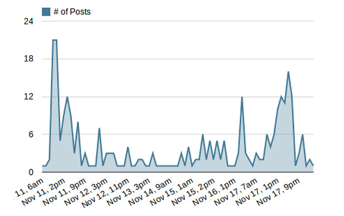
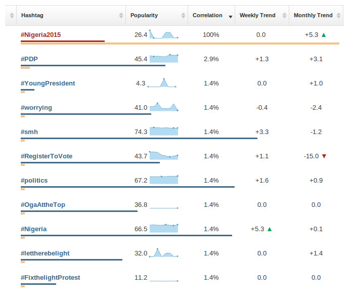
Conversations were happening real-time, people were surfing the internet in the bid to find out what was going on, we studied and compared trends like #NigeriaDecides, #GEJOneMoreTime, #Buhari2015, #Nigeria2015 and more, we analyzed sentiments while charting demographic data. The rest of the data we unbundled, digitized and converted to interactive visual representations were crunched from the press, nongovernmental organizations and Nigeria’s Independent National Electoral Commission (INEC). Some of these include data identifying and mapping high-risk violent areas and ballot box snatching rates pre and post elections. These allowed for security precautions and quick factchecking.
During this time, we encountered challenges; due to the small size of the team and available resources deployed for the project, we were overflowing with data, the conversations were quick with twists and turns, there was so much data to sieve through, simplify and publish in so little time. Another challenge was the audacity of certain trends and conversations, especially of propagandist in nature. The trends were so audacious that they overshadowed every other discussion around the time, but this too we were able to break through by learning the act of strategic publishing of factual electoral data related to that trend.
By June 2015, the project had published hundreds of interactive visualizations and analysis with a people reach of almost a million. As a result the citizens and electorates were able to discover, engage and gain access to simplified data and factual key components of the election process, such which included campaign finance and spending, agendas and manifesto, ballot qualification, voter registration, voting procedures, Permanent Voter’s Card (PVC) distribution, electoral violence, ballot box snatching, polling stations, Electronic Card Reader (ECR) testing, components, advantages and opinions surrounding its utility.
Further more the project made a case for the importance of innovating using social data, and open data, and proving that adapting principles of visual design to both can enhance transparency, foster accountability and aid voter education thus allowing groups and citizen to take a more active participatory role in electoral processes.


